Marcelo López Castro
Data Analyst | Data Engineer
About Me
My name is Marcelo. I'm a Data Analyst and Data Engineer with a background in Agronomic Engineering and a strong passion for transforming data into actionable insights.Driven by data-informed decisions, I helped reduce costs by 50% at Ideas en Verde by optimizing service workflows using SQL and Power BI.I'm looking to join an innovative IT team where I can continue to grow, contribute my analytical skills, and help drive smarter business decisions.
Skills

SQL Server | Power BI | Python | Tableau | AWS | Excel
Featured Projects
🟨 Python | SQL | AWS
ORDERS – ETL Pipeline and Cloud Integration (2025)
Built a fully functional local ETL pipeline using Python and real CSV order data. Applied cleaning and validation logic, generated logs, and automated the output upload to AWS S3 for querying in Athena using SQL.
🟨 Python | SQL | AWS
Advanced ETL Pipeline with Step Functions & Athena – AWS Orders Project (2025)
Developed a fully automated ETL pipeline integrating local processing with AWS cloud services. Implemented modular Python scripts for extraction, transformation, validation, and logging. Converted cleaned CSV data into compressed Parquet (Snappy) and uploaded it to Amazon S3. Orchestrated Lambda functions via Step Functions to query the dataset in Athena, returning aggregated sales results directly from S3.
🟥SQL | Power BI | DAX
MEDORO 9 – PLANT-WIDE EFFICIENCY DASHBOARD(2025)
Exploratory dashboard covering setup, production, downtime, and maintenance across all machines (2022–2025). Includes advanced filters by operator, shift, product, and die; color-coded KPIs; and a scatterplot for efficiency analysis. Used by the factory team to monitor and improve performance in real time.
🌿Power BI | SQL | Excel
IDEAS EN VERDE – OPTIMIZATION STRATEGIES IN CORPORATE LANSCAPING (2025)
Analyzes 2025 performance using 20+ years of data. Highlights seasonal efficiency shifts, strong client retention, and a strategic revenue concentration, all visualized through geographic and operational KPIs.
🌍Tableau | Excel | Data Storytelling
WORLD HAPPINESS REPORT 2025 – GLOBAL INSIGHTS DASHBOARD
Interactive Tableau dashboard exploring the drivers of happiness across 130+ countries. Includes GDP, health, freedom, generosity, and corruption correlations, with custom maps, trend lines, and visual storytelling.
🌱Excel | SQL | Python | Power BI
IDEAS EN VERDE OPTIMIZATION (2003-2024)
A long-term analysis of efficiency, self-production growth, and digital transformation. Uses SQL and Power BI to uncover trends in plant replacement, customer loyalty, and profitability.
📈SQL | Python | Power BI
ACCENTURE HISTORIC STOCK PRICE 2001-2021
Exploratory dashboard analyzing 20 years of Accenture’s stock performance. Combines SQL, Python (EDA + ETL), and Power BI to uncover trends, volume patterns, and extreme price changes.
Certifications

Google Data Analytics | Coursera |issued 2025

Data Analytics - Teaching Assistant | HENRY issued 2025

Data Analytics | HENRY |issued 2024

EF SET Certificate | issued 2025
Thanks!
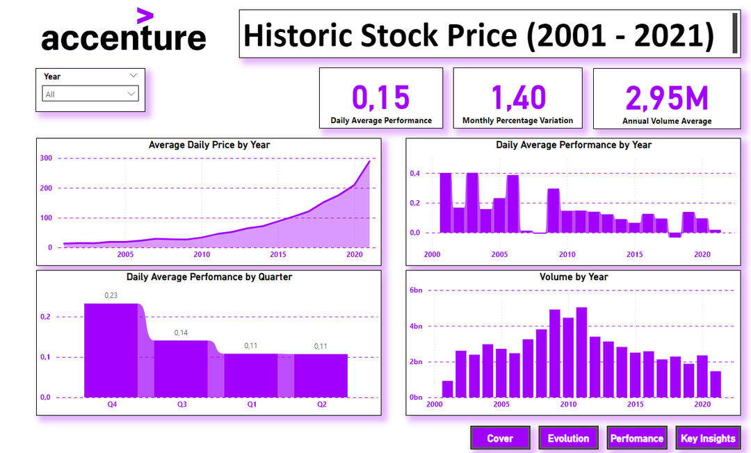
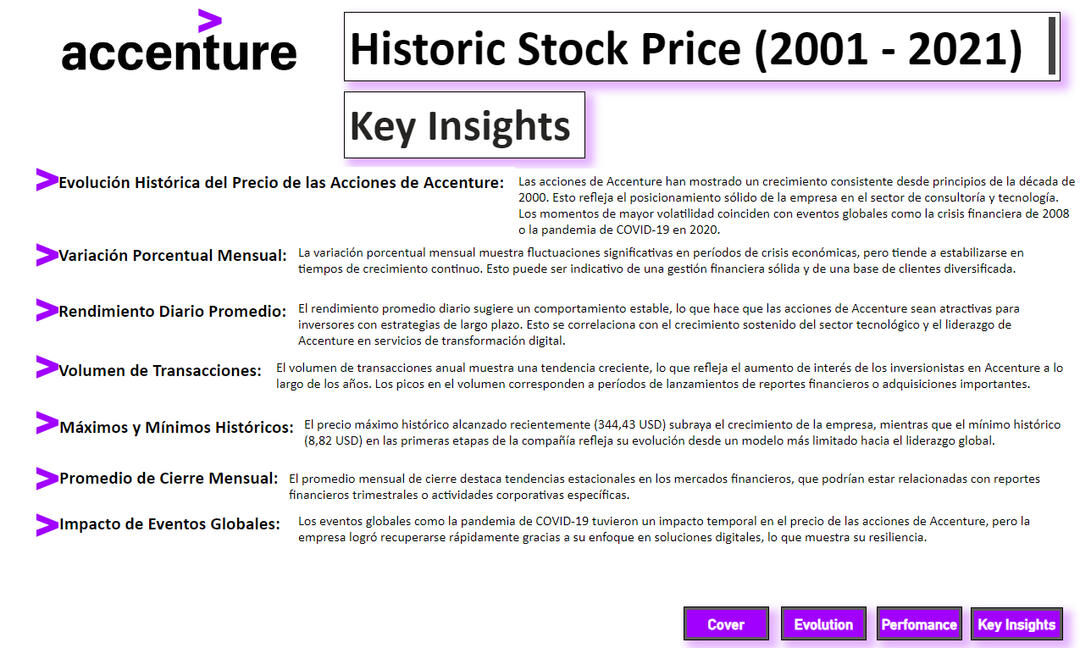
Accenture Stock Price Analysis (2001–2021)
SQL Server | Python | Power BI
This project explores over two decades of Accenture's stock price performance using real historical data sourced from Kaggle. The goal was to uncover long-term trends, identify volatility patterns, and deliver valuable insights for investors and stakeholders through an interactive Power BI dashboard.
🧠 Key Insights📈 The company’s stock price has shown strong growth since the early 2000s, peaking at $344.43 in 2021.🌍 Volatility increased during global events like the 2008 financial crisis and COVID-19, yet Accenture quickly recovered.💹 Monthly percentage variation reveals fluctuations in unstable periods and stability during sustained growth.💼 Daily performance remains consistent, ideal for long-term investment strategies.🔄 Transaction volume has increased steadily, signaling rising investor interest over time.
🛠️ Tech StackSQL Server: Data storage and queryingPython (pandas, numpy, matplotlib, seaborn): Data cleaning, EDA, and transformationPower BI: Dashboard design and storytellingData source: Kaggle CSV datasets
📸 Dashboard Screenshots
Cover Page

Price Evolution & KPIs
Performance Metrics
Key Insights Explained
Ideas en Verde – Optimization (2003–2024)
Excel | SQL Server | Python | Power BI
This project analyzes more than two decades of operational data for Ideas en Verde, an indoor gardening company serving corporate clients in Argentina. The focus was on cost efficiency, sustainability, and strategic growth—especially after the disruptions of the COVID-19 pandemic.
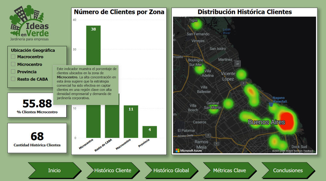
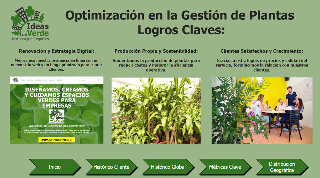
🧠 Key Insights🌱 In-House Production: Increased from 0% to 75% after 2021, reducing external purchases and improving margins.💡 Efficiency Gains: Lower plant replacement rates due to better plant care and production strategies.💰 Pricing Optimization: Smart pricing agreements led to a 50% increase in profitability.📍 Geographic Insights: Over 55% of clients are concentrated in Buenos Aires' Microcentro, highlighting commercial targeting success.🌐 Digital Transformation: Launch of a new website and blog led to +20% in new client acquisition.
🛠️ Tech StackSQL Server: Long-table format modeling, data consolidation, and transformationPython: EDA with pandas, matplotlibPower BI: Interactive dashboards with custom filters and dynamic KPIsData Source: Historical CSV datasets and internal operational files
📸 Dashboard Screenshots
General Cover Page
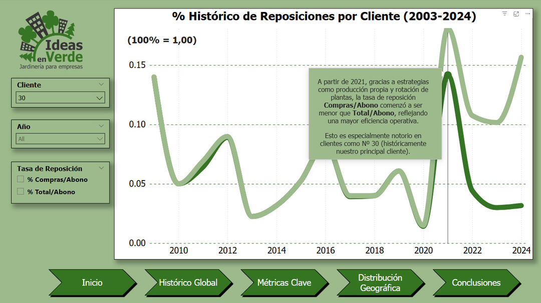
Plant Replacement Trends by Client (2003–2024)
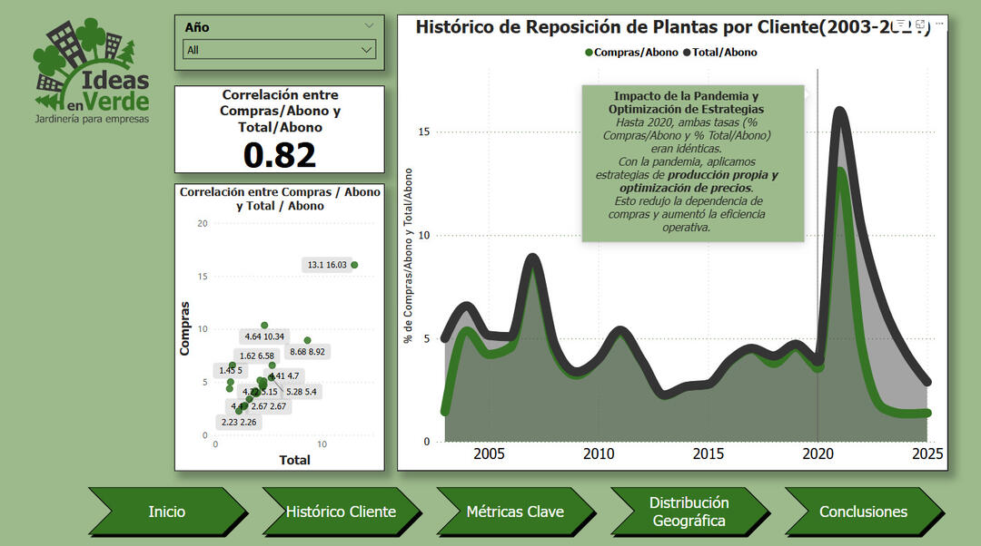
Metric Correlations and Operational Performance
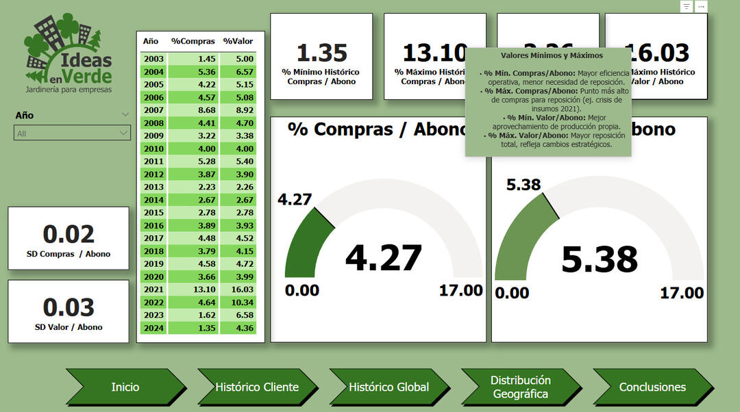
KPI Overview – Min/Max by Year
Heatmap and Client Distribution
Summary of Key Business Improvements
World Happiness Report 2024 – Global Insights Dashboard
Tableau | Excel | Data Storytelling
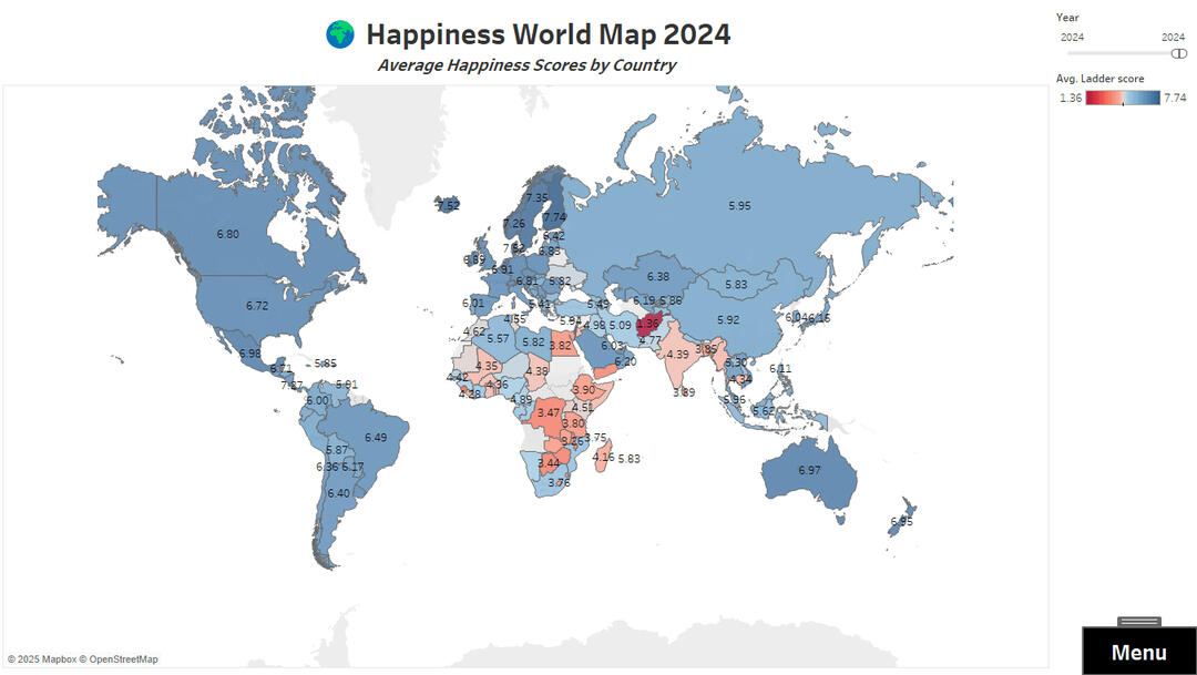
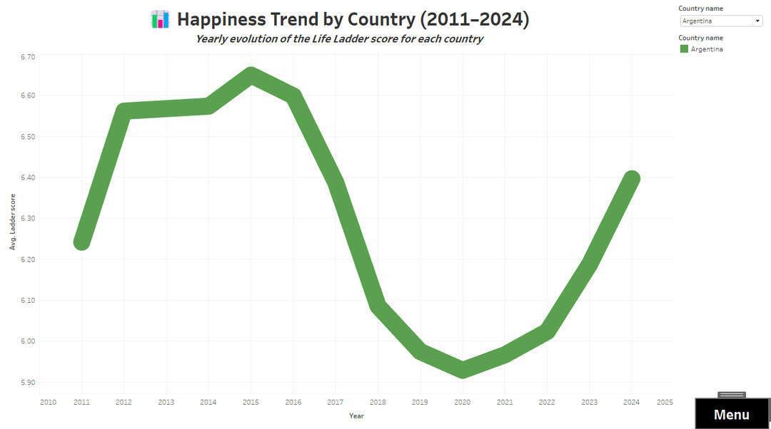
This project explores the key drivers of happiness across more than 130 countries, using the official dataset from the World Happiness Report 2024. Built entirely in Tableau, it offers an interactive and visual journey through global well-being indicators.
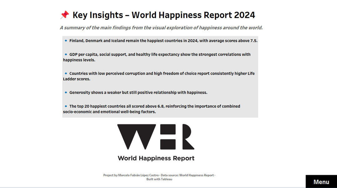
🔍 Key Insights✅ Finland, Denmark, and Iceland top the happiness index with scores above 7.5.
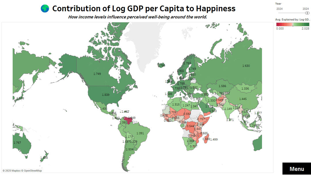
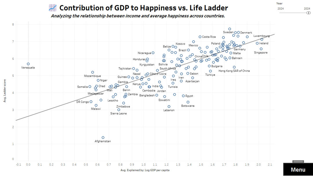
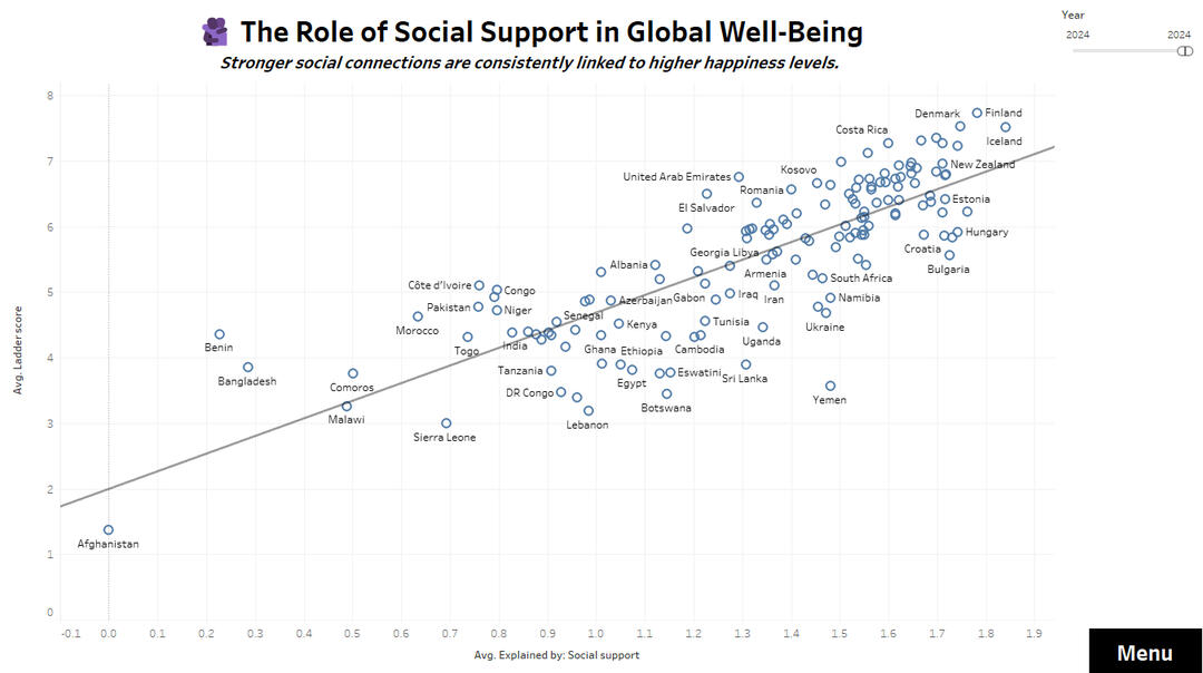
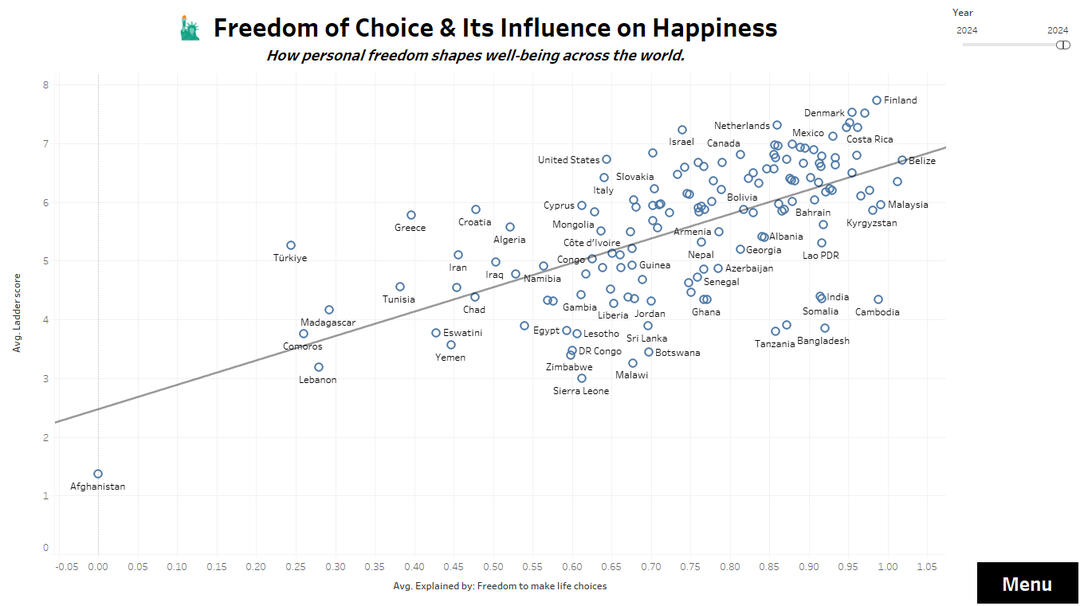
✅ Strongest positive correlations: GDP per capita, healthy life expectancy, social support, and freedom of choice.
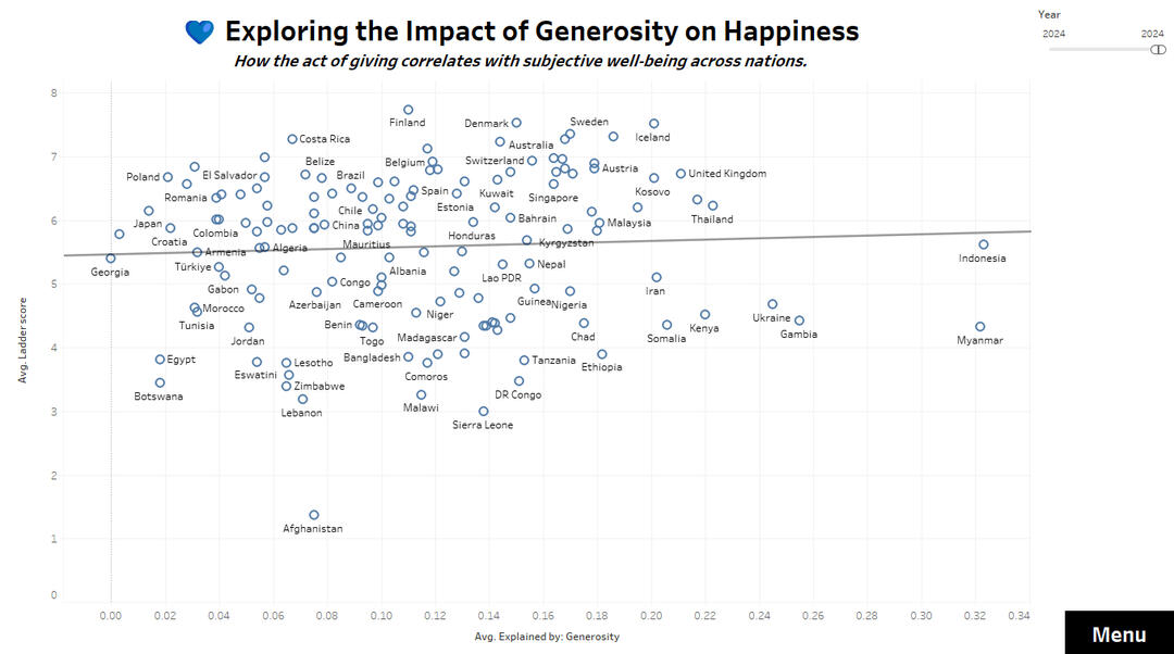
✅ Generosity shows a weaker but still positive link to happiness.
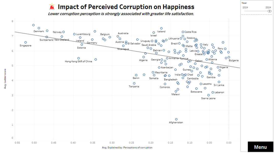
✅ Countries with lower perceived corruption consistently report higher life satisfaction.
✅ The top 20 happiest countries all scored above 6.8.🛠️ Tools & Methods🔹 Tableau dashboards with interactive filters, tooltips, and navigation menu.
🔹 Thematic maps, trend lines (2011–2024), scatter plots, and a ranked word cloud.
🔹 Data source: World Happiness Report 2024 (CSV & XLSX).
🔹 Focus on cross-country comparisons, correlation analysis, and user experience.📊 Visual Highlights🌍 Global Map of happiness scores
📈 Trends by Country (selectable by dropdown)
💰 Income vs. Happiness (log GDP & Life Ladder)
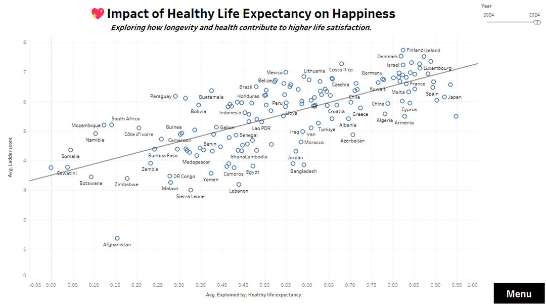
❤️ Health and Longevity Impact
💙 Generosity and its weak correlation
🧑🤝🧑 Social Support and emotional well-being
🚨 Perceived Corruption and happiness scores
🗽 Freedom of Choice and satisfaction
🌟 Top 20 Word Cloud with happiness categories
📌 Summary of Key Findings
🚀 Impact & ConclusionThis dashboard illustrates how data storytelling can uncover meaningful global patterns. Designed as a portfolio project, it leverages Tableau’s full interactivity to guide users through the complex relationships between economic, social, and emotional factors shaping well-being worldwide.
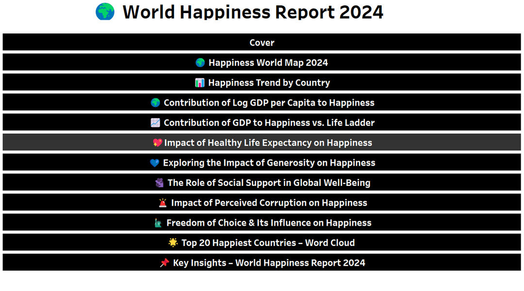
📸 Dashboard Screenshots
Navigation Menu
General Cover Page
Happiness World Map 2024
Happiness Trend by Country
GDP per Capita Contribution
GDP vs. Life Ladder
Life Expectancy & Happiness
Generosity and Happiness
Social Support Impact
Perceived Corruption
Freedom of Choice
Top 20 Happiest – Word Cloud

Key Insights
Ideas en Verde – Optimization Strategies in Corporate Landscaping (2025)
Power BI | SQL | Excel
This project builds on previous analyses of Ideas en Verde (2003–2024), incorporating updated 2025 data and improved KPIs. It explores seasonal efficiency, production strategies, and client revenue contribution to optimize long-term operations in corporate landscaping services.
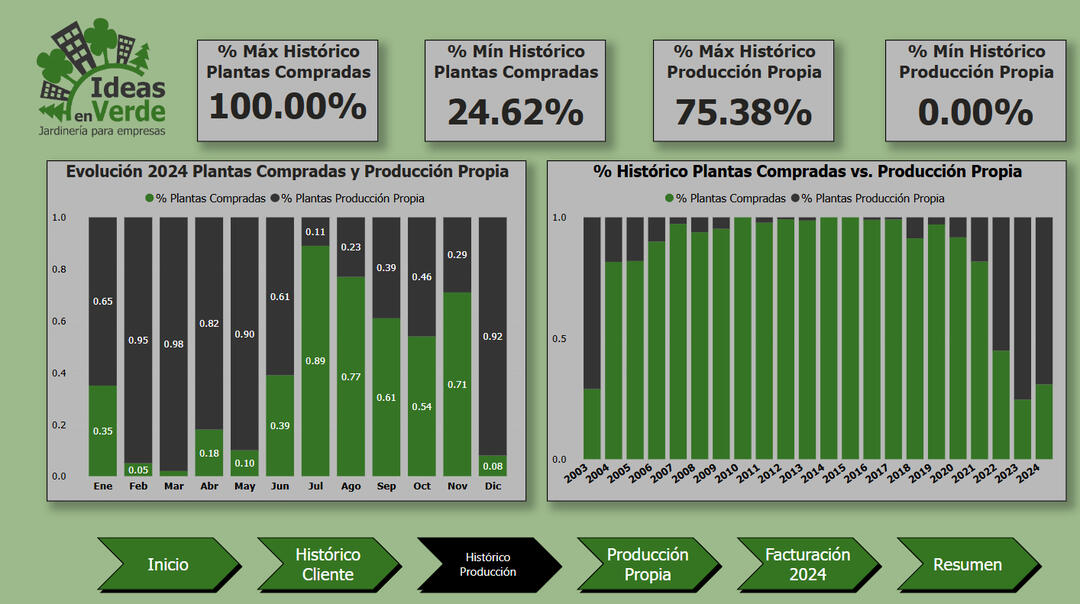
🔍 Key Insights:✅ Seasonal Efficiency Drop: In-house plant production decreases sharply between July and November due to winter conditions.
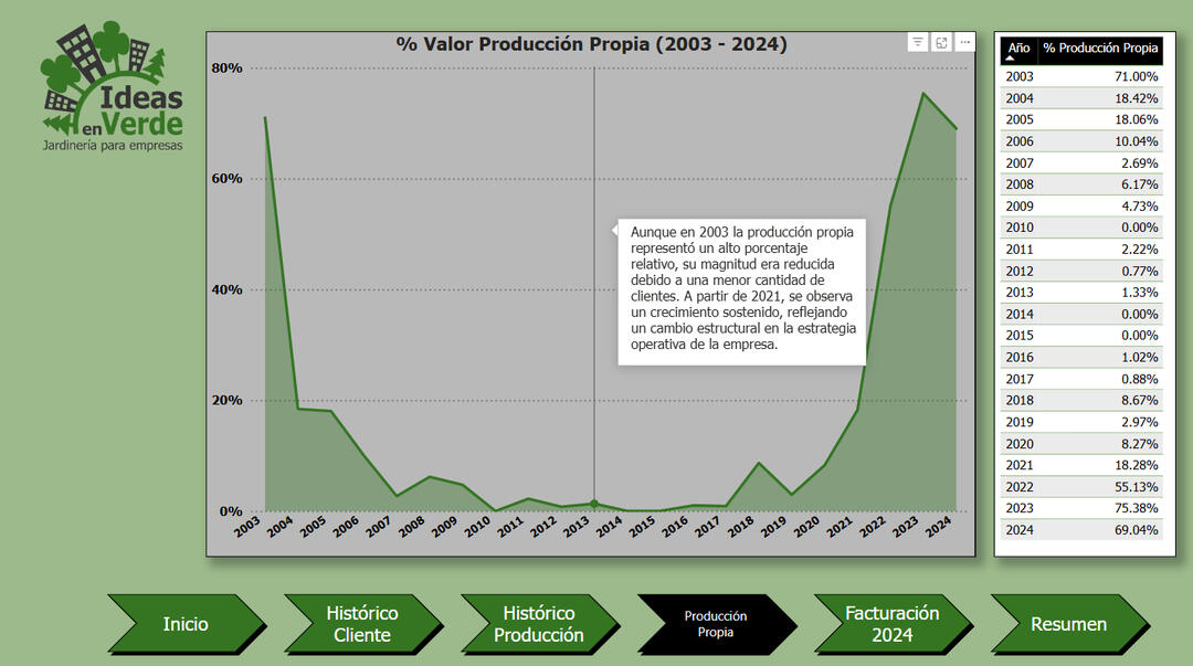
✅ Strategic Shift Post-Pandemic: Self-production rates surged from 2021, peaking at 75.4% in 2023.
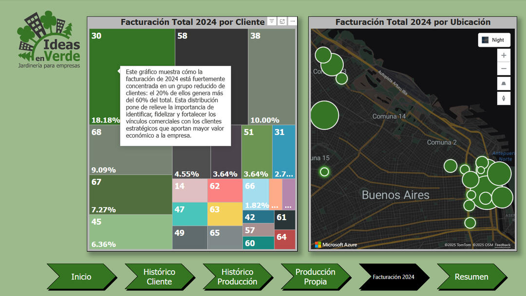
✅ Client Retention: Most clients have long-term relationships exceeding 100 months.
✅ Revenue Concentration: 20% of clients contribute over 60% of total revenue, guiding commercial focus.🛠️ Tools & Methods:📊 Power BI dashboards with drill-through navigation, slicers, and custom visuals.
🧹 Data cleaning and modeling in SQL and Excel to unify 20+ annual tables (2003–2025).
🗺️ Interactive geolocation mapping of client revenue clusters.
📸 Dashboard Screenshots:
Cover Page

Client History Overview

Production Input Breakdown – Monthly vs. Historical
Own Production Value Over Time (2003–2024)
2024 Revenue Distribution by Client and Location
Summary of Findings and Strategic Takeaways

🔁 ETL Pipeline with Athena Integration - AWS Orders Project (2025)
Python | AWS | SQL
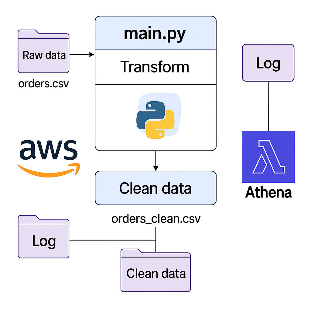
This technical project demonstrates a fully functional local ETL pipeline built in Python. It performs data cleaning, validation, logging, and exports a clean CSV file to AWS S3, where it's queried using SQL via Amazon Athena. The process includes file structure automation, error tracking, and cloud upload with SQL schema creation for analytics.
🔍Key Insights:✅ Raw .csv orders file is transformed into a clean, validated dataset.
✅ A new column is created during transformation to track total amount per order.
✅ A validate.py script ensures schema consistency and highlights potential issues.
✅ Execution logs are generated for each pipeline run and stored separately.
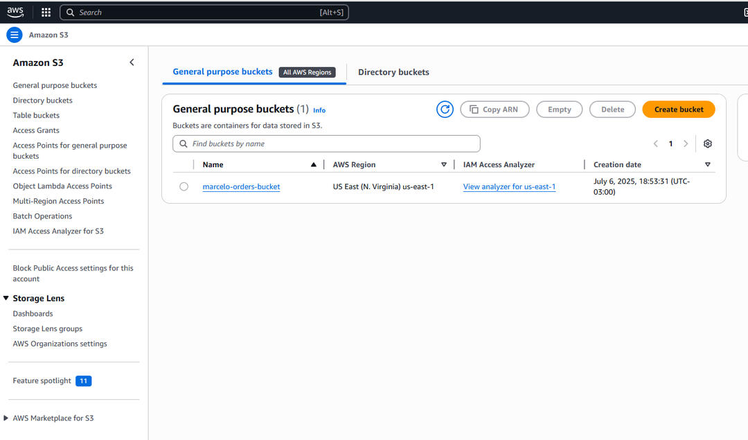
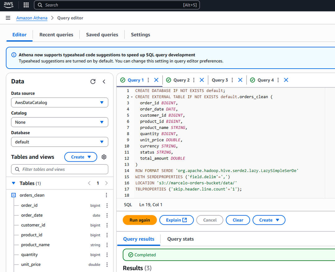
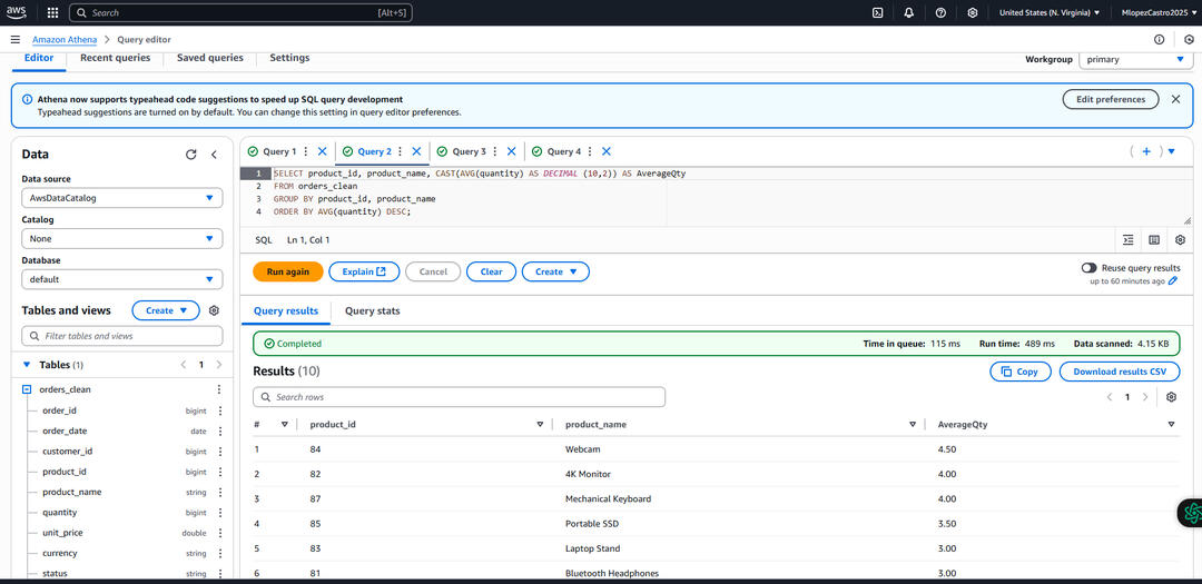
✅ Final clean file is uploaded to AWS S3 and connected to Athena for SQL queries.
✅ Athena queries allow immediate aggregation and filtering of cloud-stored data.🛠 Tools & Methods:🔹 Python: modular scripts for transform, validate, and main, with logs.
🔹 AWS S3: data storage and access via marcelo-orders-bucket.
🔹 Athena: external table creation, SQL schema parsing, live queries.
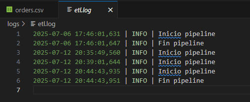
🔹 Logging system: timestamps of each run stored in .log file.
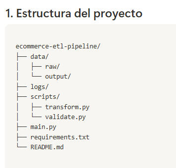
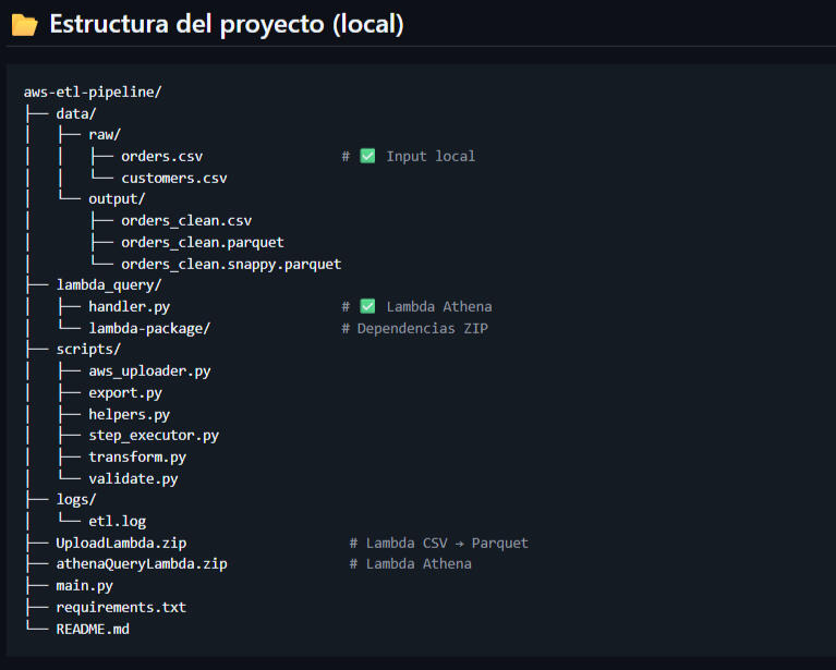
🔹 Folder structure: organized into data/raw, data/output, logs, and scripts.
🖼️ Visual Highlights:
Process diagram of the full ETL flow (main.py + S3 + Athena)
Project Structure
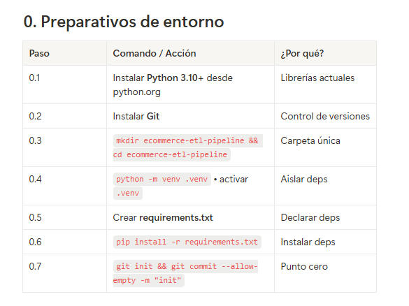
Environment Setup
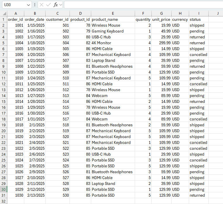
Raw Data (Excel View)
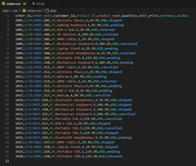
Raw CSV Preview (VS Code)
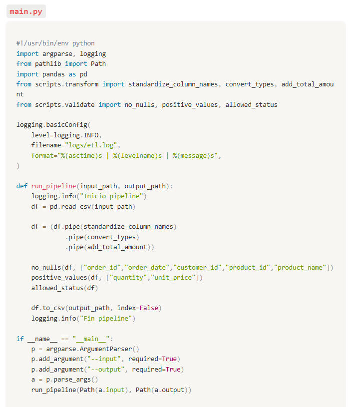
main.py – Orchestrating the Pipeline
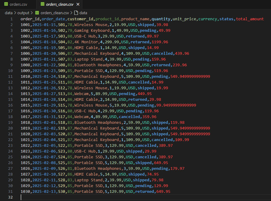
Clean CSV with Total Amount Column
Execution Log – etl.log (VS Code)
AWS S3 Bucket – Uploaded Clean File
Athena Table – Table Creation SQL Script
Athena Query – Average Quantity by Product
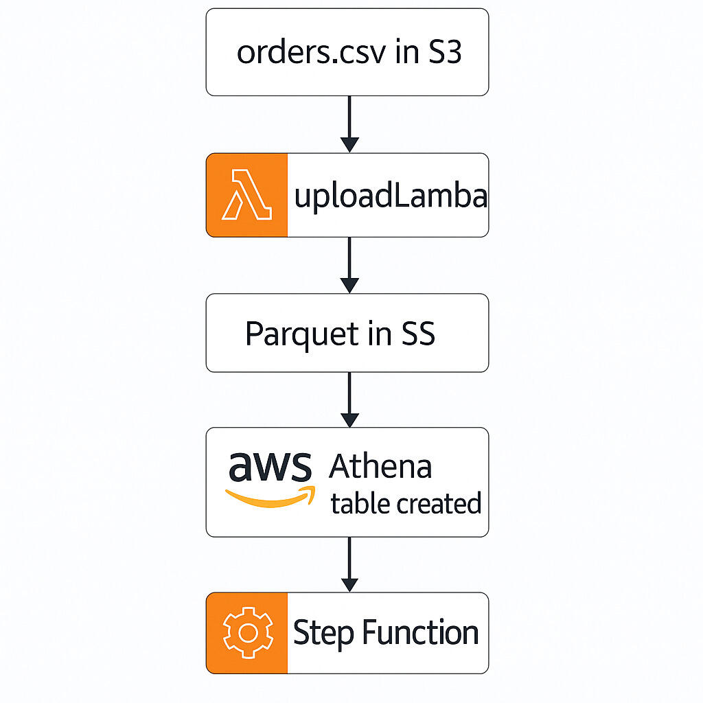
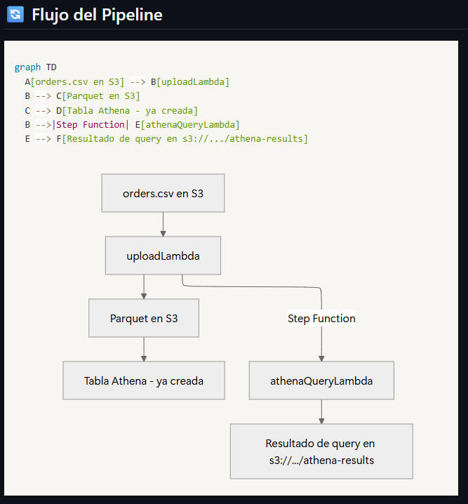
🔁 Advanced ETL Pipeline with Step Functions & Athena – AWS Orders Project (2025)
Python | AWS (S3 • Lambda • Step Functions • Athena) | SQL
This technical project showcases a fully functional ETL pipeline built in Python and deployed with AWS serverless services. It ingests local CSV order data, applies cleaning, validation, and logging, and exports the output in both CSV and optimized Parquet (Snappy) formats to AWS S3. The pipeline orchestrates two AWS Lambda functions through Step Functions: one for data transformation and Parquet generation, and another for automated querying in Amazon Athena using SQL. The process includes automated file structuring, error tracking, Glue Catalog integration, and schema creation for analytics.
🔍Key Insights:✅ Raw .csv orders file is transformed and optimized into Parquet (Snappy) format for faster cloud querying.
✅ Data cleaning, validation, and schema consistency checks are applied before cloud upload.
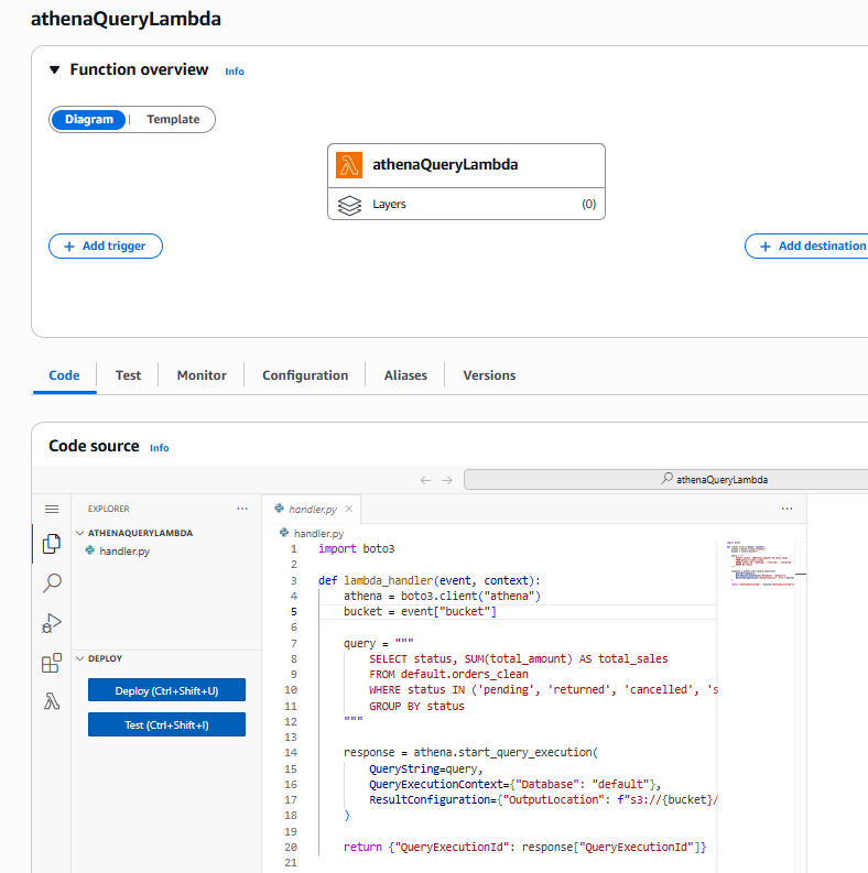
✅ AWS Lambda function #1 automates CSV → Parquet conversion and stores it in S3.
✅ AWS Lambda function #2 runs Athena SQL queries automatically and stores the results back in S3.
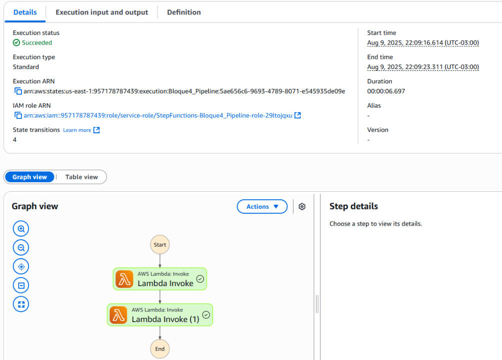
✅ AWS Step Functions orchestrate the end-to-end pipeline without manual intervention.
✅ Glue Catalog integration enables Athena to query the Parquet dataset efficiently.
✅ Athena queries provide immediate aggregated sales insights directly from the cloud.🛠 Tools & Methods:🔹 Python: scripts for CSV-to-Parquet transformation, schema validation, and Athena query execution.
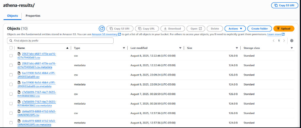
🔹 AWS S3: storage for raw CSV, transformed Parquet, and Athena query results.
🔹 AWS Lambda: two independent functions — one for conversion (Parquet) and one for SQL query execution.
🔹 AWS Step Functions: orchestration of the two Lambda functions for a fully automated pipeline.
🔹 Athena + Glue Catalog: external table creation, Parquet schema recognition, and direct SQL querying.
🔹 Parquet (Snappy): optimized cloud storage format for faster query performance.
🔹 Project structure: organized into data/, lambda_query/, ZIP deployment packages, and AWS console resources.
🖼️ Visual Highlights:
High-Level Pipeline Diagram (S3 + Lambda + Athena + Step Function)
Project Folder Structure in VS Code
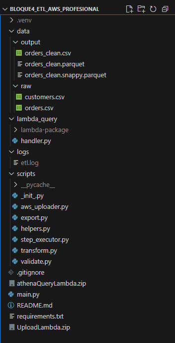
Local Project Structure (ETL Scripts, Data, Logs, Lambda Packages)
AWS Pipeline Flow: From CSV Upload to Athena Query Results
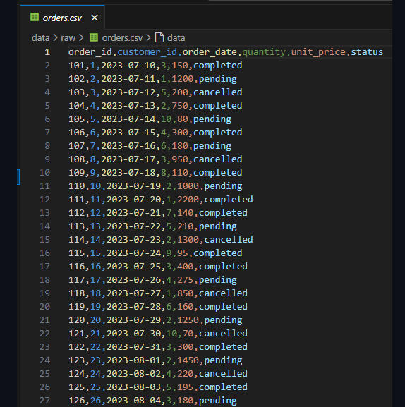
Raw Orders Dataset (CSV View)
AWS Lambda Function: Upload and Conversion to Parquet

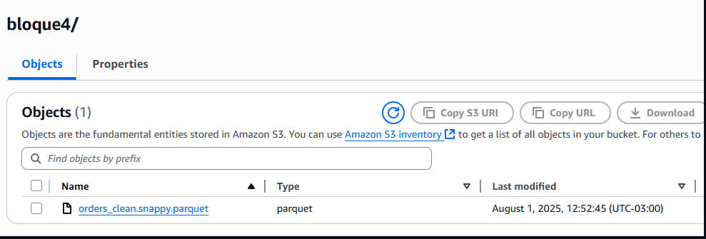
Snappy-Compressed Parquet File Stored in S3
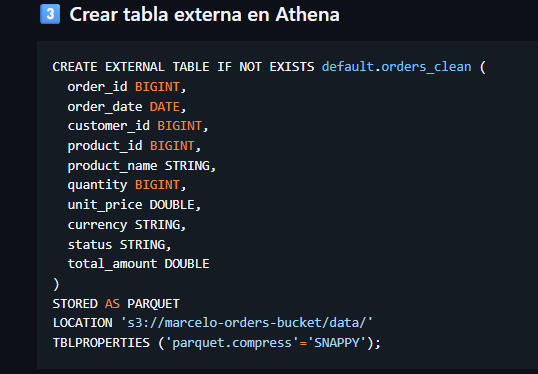
Athena External Table Creation for Parquet Data
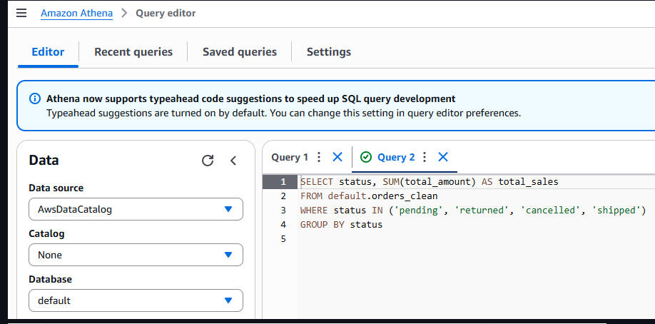
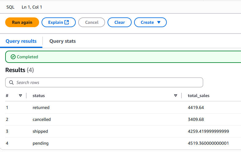
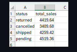
Athena Query to Aggregate Total Sales by Status
Query Results: Total Sales per Order Status
AWS Lambda Function – athenaQueryLambda (Automated Query Execution)
AWS Step Functions Workflow Orchestrating Lambda Calls

Step Functions Execution Details – Run Succeeded
S3 Bucket – athena-results Query Output Files
Final Aggregated Query Output (CSV) – Total Sales by Status
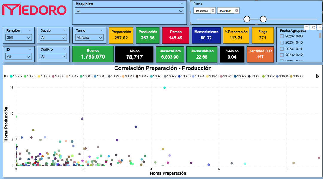
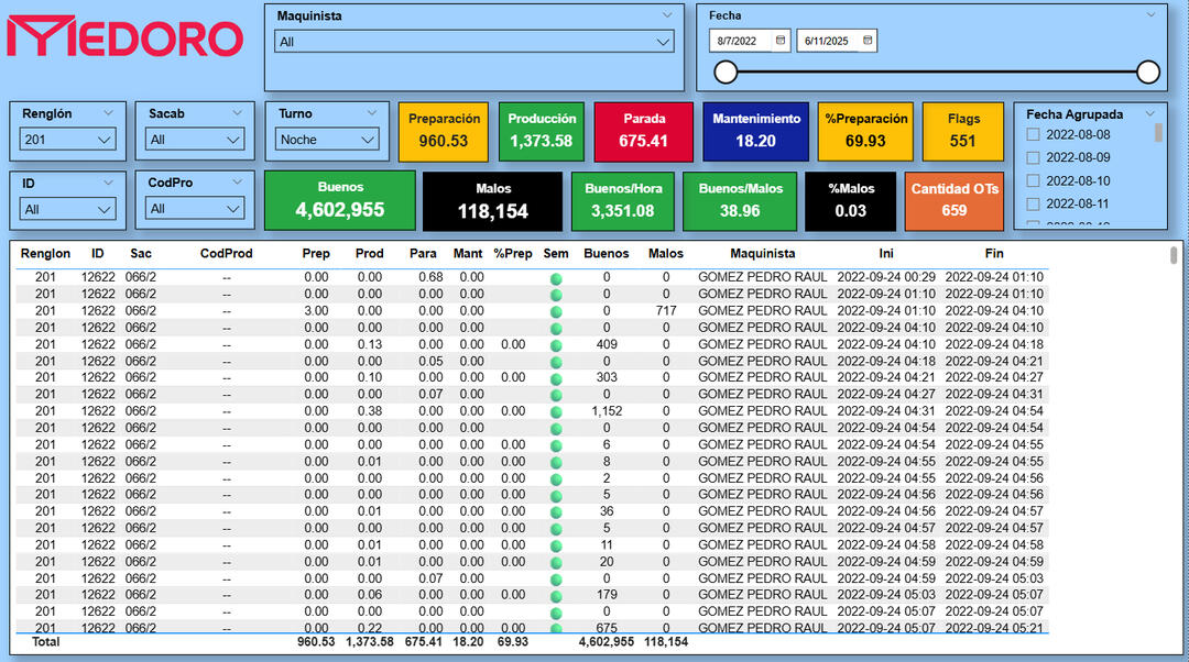
🛠️MEDORO 9 – Plant-Wide Efficiency Dashboard
SQL | Power BI | DAX
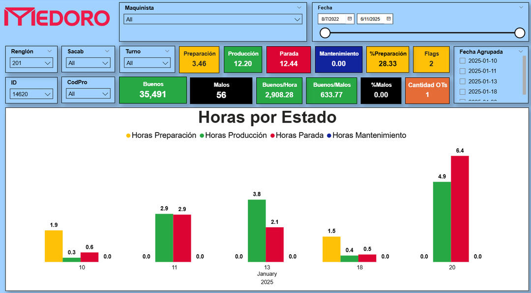
🔍 Key Insights✅ Unified setup, production, downtime, and maintenance tracking for all machines (2022–2025)
✅ Integrated filters by operator, shift, product code, and die (sacabocado)
✅ Created new KPIs: production speed, % of defective units, total flags, OT count
✅ Improved visual clarity with color-coded cards and dynamic filtering
✅ Enabled real-time analysis and comparison across work orders using scatterplot🛠️ Methods & Tools🔷 SQL Server: extended views, plant-wide modeling, timestamp corrections
🔷 Power BI: global filtering panel, color-coded dashboards, scatterplots
🔷 DAX: performance metrics, flag calculations, efficiency ratios
🔷 Excel: offline replica for factory staff without SQL access
This is a comprehensive, real-time dashboard for monitoring operational efficiency across the entire factory. Built on top of validated data models, it supports both daily decisions and long-term analysis.
📸 Dashboard Screenshots
Cover Page
Filtered Event Log – Setup, Production, Downtime
Daily Time Distribution by Event Type
Efficiency KPIs – Single Order View
Plant-Wide KPI Summary and OT Flags
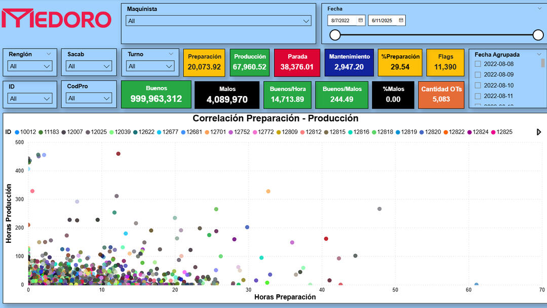
Scatterplot – Setup vs. Production Time by Order